Bounce Back Digital Branding
Showcasing branding guidelines and marketing assets for Bounce Back Digital, a digital agency/fintech startup.
✨ Introduction
Bounce Back Digital, parent company of Bounce Back Coin, is a digital agency and fintech startup that focuses on providing innovative solutions in the digital space. The branding project aimed to create a cohesive visual identity that reflects the company's mission and values.
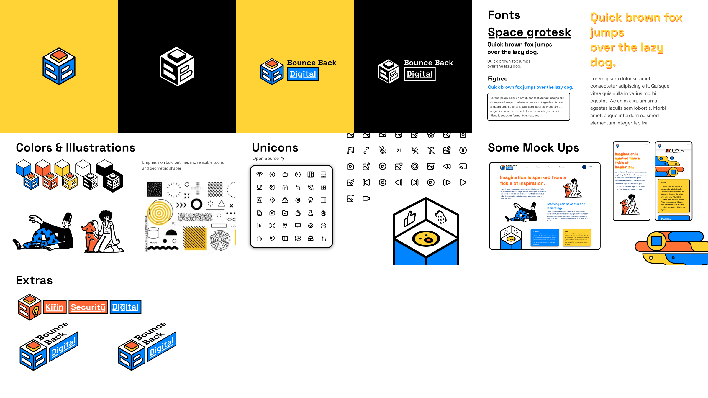
🔷 Logomark
Designed by Samridh Arora, designed to convey a sense of professionalism and multi-faceted services. The logomark is a stylized representation of the letter "B" and "D" on an isometric cube to represent the brand name "Bounce Back Digital".
Samridh Arora on Linkedin.
🔍 Research
Direction #1 - Light Hearted, Minimalist with Stroke Outlines
A playful exploration of the branding with a modified logomark to align with Bounce Back Coin's branding.
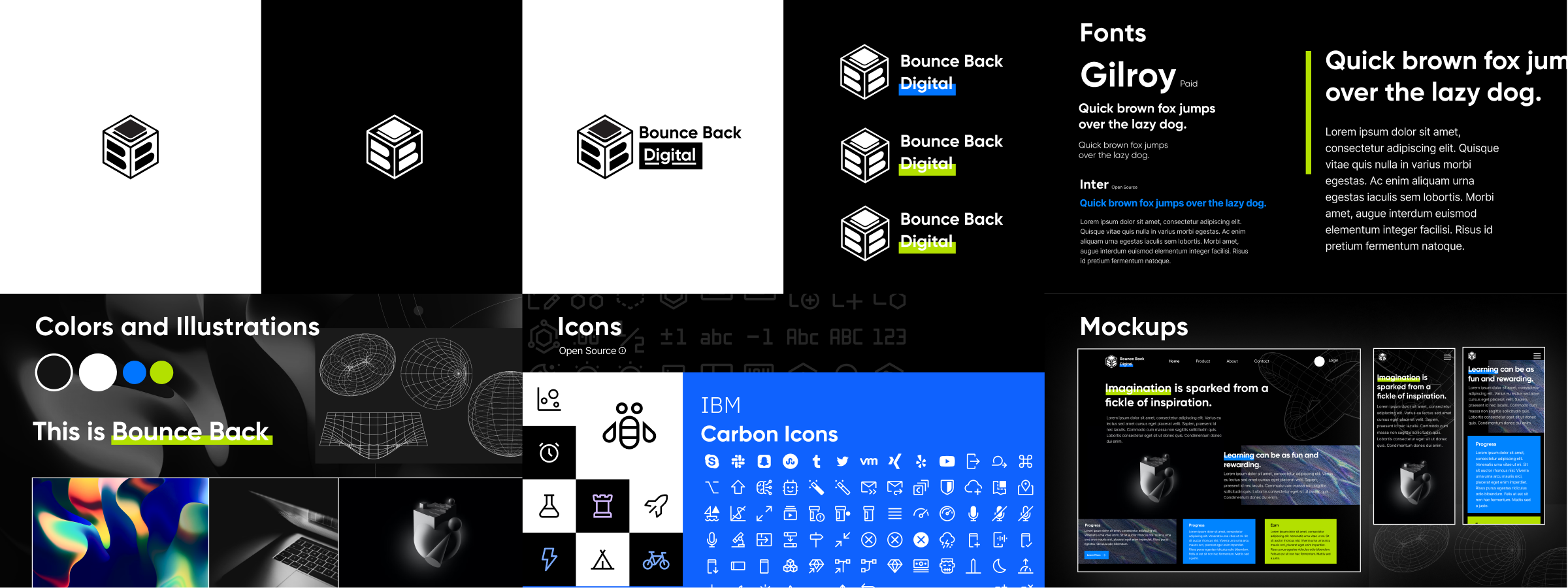
Direction #2 - Professional, Gradients, Wireframe, Bold
✅ Final Branding
For the final branding, we decided to go with the second design direction, which was more professional and aligned with the company's vision. After a few changes like removing the green color and switching to a more blueish color palette, we finalized the branding.

📢 Marketing Assets
Social Media Carousel

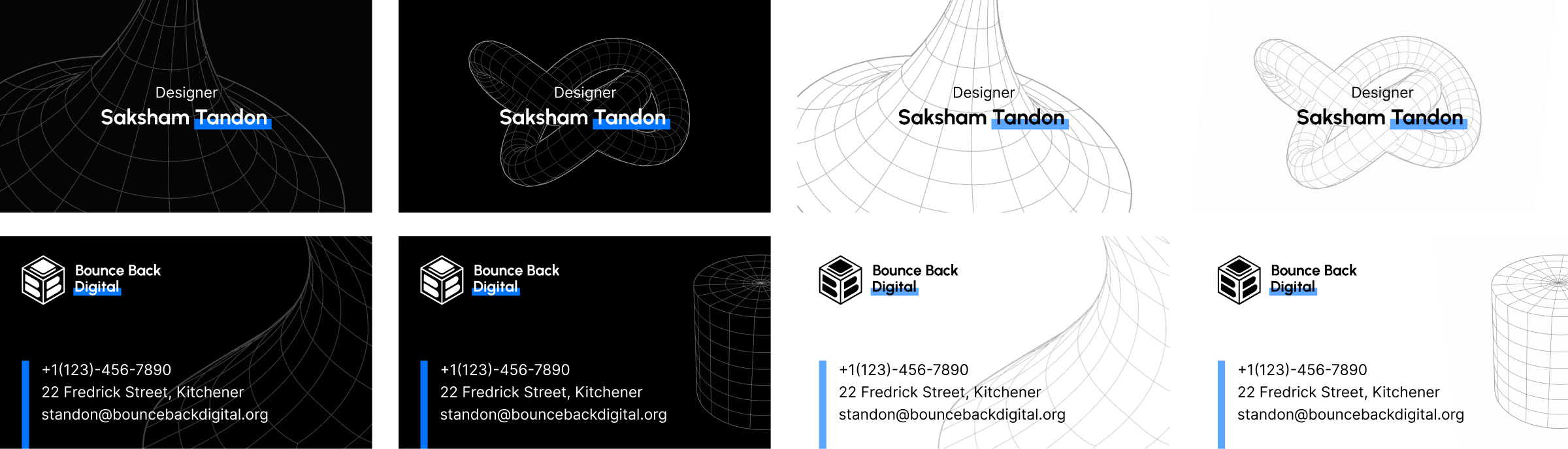
Business Cards
Print Materials
Print materials showcasing various services offered by Bounce Back Digital.

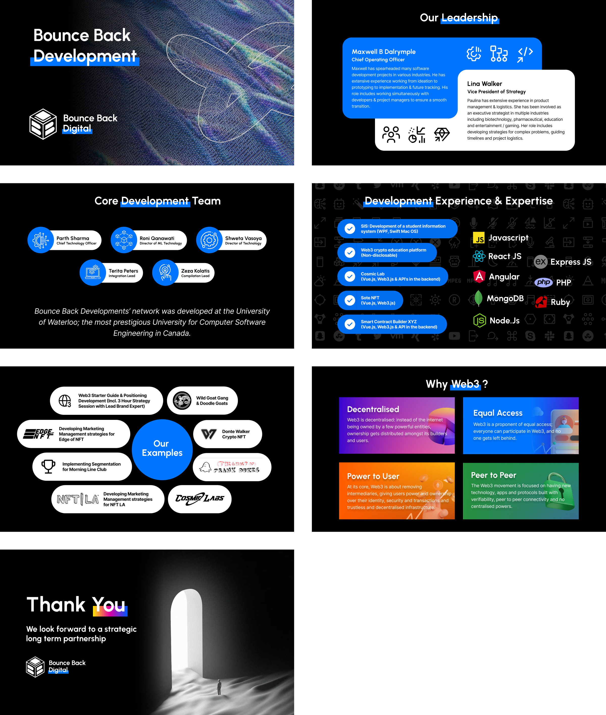
Presentation Slides