Lynk - UX Case Study

Jaunary 2021 - April 2021UX-DesignProduct-Design

Lynk is a platform designed to combat social isolation by connecting individuals with local activities and communities.

💡 The Idea

Lynk began as a project focused on addressing the growing issue of social isolation and its impact on mental and physical health, particularly among young adults transitioning into new environments. We aimed to create a platform that fosters real-world connections through shared activities.

📝 Our Goal

Minimize the stress and anxiety resulting from prolonged social isolation by providing a seamless way for individuals to find and participate in nearby activities and meet new people.

🎯 Our Focusing Themes

🤝 Connection 🧠 Mental Wellness 📍 Local Activities 🌱 Community Building

❓ The Core Problem

How can we effectively connect young adults in new environments to local activities and people to combat social isolation and its negative health impacts?

🧠 My Roles

🔍 UX Research ✨ Visual Design 🧪 Usability Testing 📱 Prototyping 📊 Business Analysis

📝 Our Solution

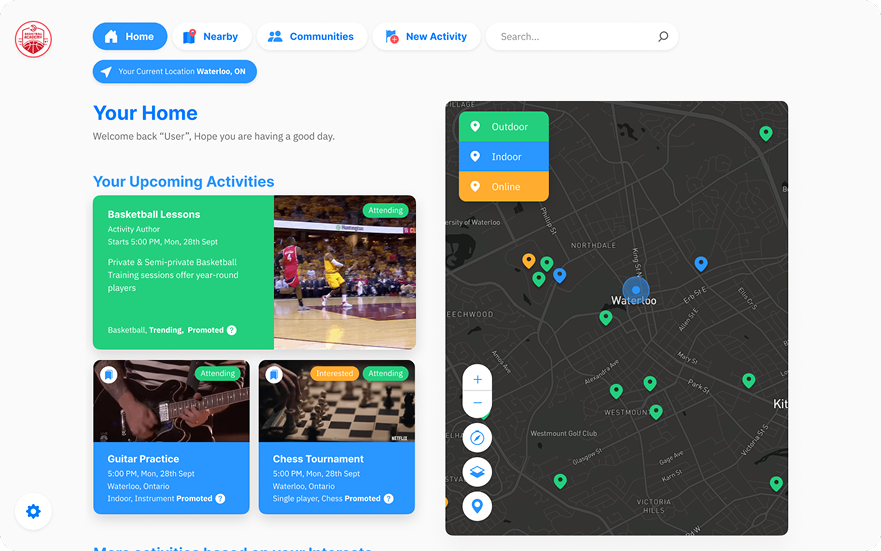
Lynk is an event organizing platform that helps people and small businesses organize and attend events in their vicinity. It is designed to reduce the stress and anxiety caused by social isolation by promoting real-world connections through local, wellness-oriented activities.

The app focuses on fostering safe, low-pressure social experiences that are easy to access and aligned with users’ emotional needs. By encouraging engagement in outdoor and group activities, the platform supports users in rebuilding routines, forming new relationships, and staying mentally and physically active.

🔍 Initial Research and Insights

We started by looking into how young adults feel and act when they're socially isolated, especially during big life changes like moving for school or work. As young adults ourselves, we brought our first-hand experiences to the table, which helped us understand what is needed to feel supported, connected, and motivated to get involved in our communities again.

Target Audience

Based on our initial research, we have identified our target market as individuals who are generally affected by poor mental health, with the following criteria:

Age Range

20-28 years. We are specifically focusing on youth on the verge of entering adulthood and its social challenges.

Location

Ontario. Geographically, we plan to restrict our application’s reach within the province of Ontario to establish a more narrow target audience.

Relocating to New Environments

Both graduates and non-graduates who are moving into new environments that are relatively unknown to them.

Target Audience Mood Board

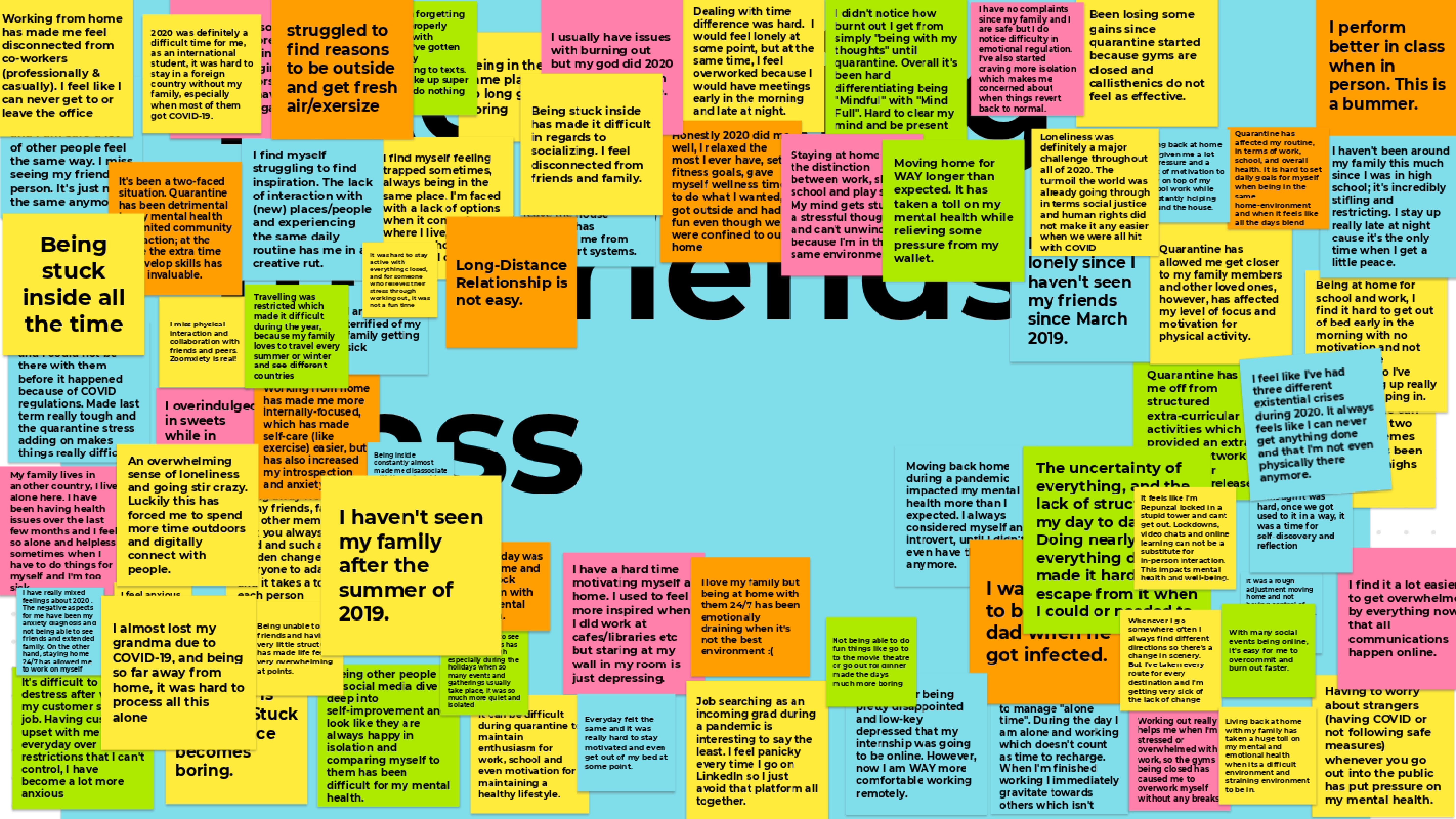
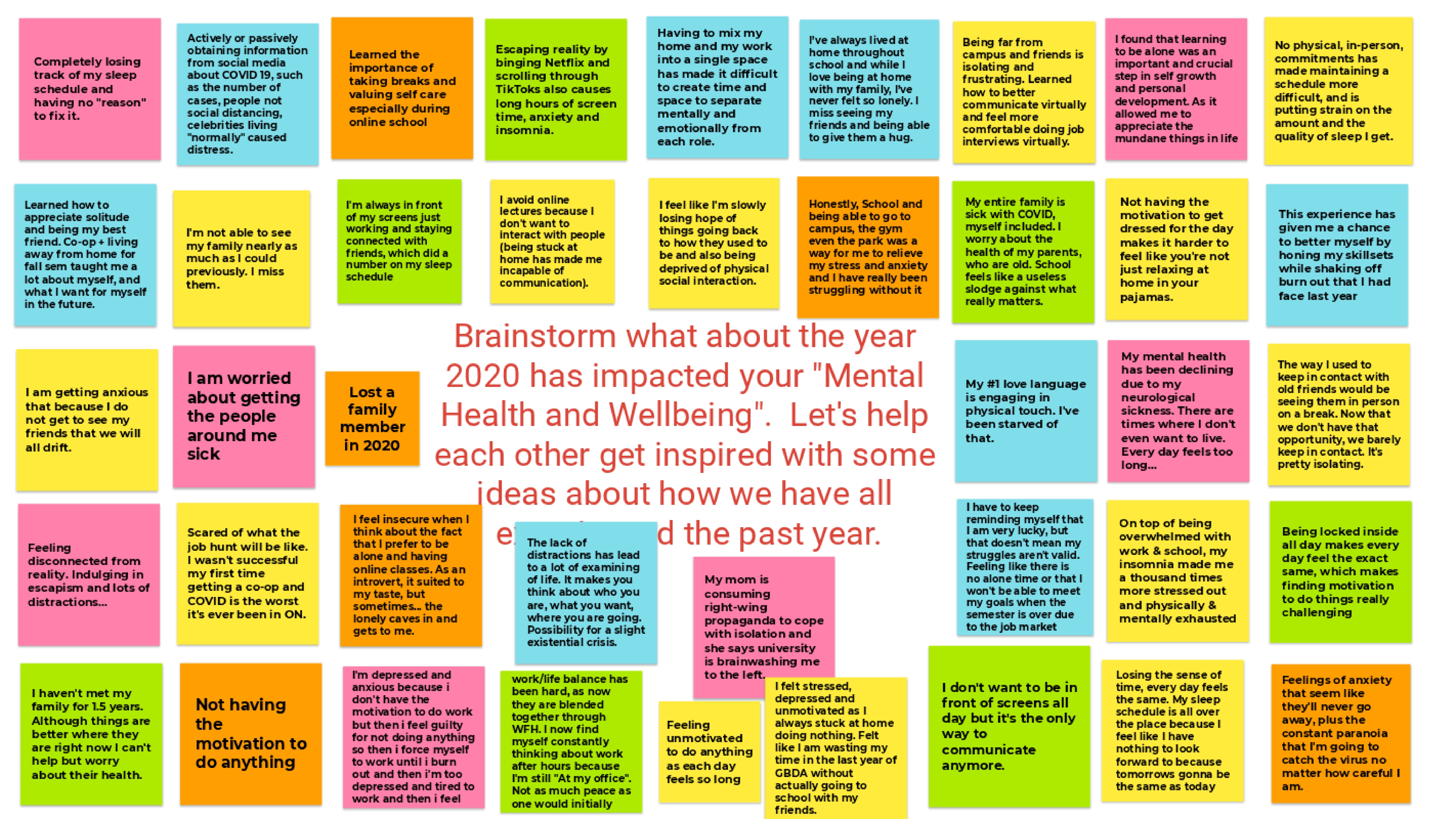
We asked university students and working professionals from our target audience to share their thoughts and feelings about social isolation on an online mood board reflecting their experiences and highlighting their struggles during COVID-19.

Summarized Insights

Wants and Needs

  • Enjoys spending time with others in outdoor settings, surrounded by nature.
  • Strongly values friendships and community families.
  • Strives for a better work-life balance within everyday life.
  • Searches for exercise tips and tricks online to maximize physical activity.
  • Prefers to establish plans with other individuals before considering independent activities.

Challenges

  • Feelings of sadness, distress, confusion, or anger when experiencing complete isolation at home.
  • Restlessness, leading to increased irritability and upset over seemingly minor things.
  • Fear and worry about mental health status when situated in unknown regions for extended periods.
  • Possible worsening of pre-existing health problems, such as chronic conditions, due to lack of outdoor activity and necessary exercise.
  • In extreme cases, signs of severe emotional distress, such as persistent insomnia, interpersonal problems, and crippling fear as a result of prolonged seclusion from society, indicating the need for assistance.

Competitive Landscape

During our initial research, we also conducted market research to better understand our target market and their needs. We performed a competitive analysis to identify gaps and opportunities in the market.

Competitors

  • Meetup: Focuses on group activities and has introduced a personalized event recommendation model to help members discover events aligned with their interests. However, it lacks a strong emphasis on emotional support and personalized experiences beyond event recommendations.

  • Citysocializer and Nextdoor: Offer local community engagement and help users connect with neighbors and local businesses. Citysocializer focuses on both in-person and virtual events, while Nextdoor is known for fostering a safe, friendly environment for neighborhood correspondence. However, these platforms do not specifically focus on emotional wellness.

  • Eventbrite: A popular event management platform that allows users to create, advertise, and sell tickets for events. It provides tools for event organizers to promote their events and reach a wider audience. Eventbrite's focus is more on logistics and event management rather than user care and emotional wellness.

  • Wine For The People and Clozette: Wine For The People offers wine tastings and events in an open, approachable setting, fostering a sense of community and inclusivity. Clozette, on the other hand, builds niche communities through lifestyle branding. Neither platform specifically addresses broader emotional needs or mental wellness.

Key Takeaway

While these platforms help with connections in different ways, they don't fully meet the emotional readiness, mental health, and accessibility needs of our target audience. This showed a clear gap: Users need a platform that reduces social friction, supports emotional well-being, and encourages a gentle return to social life, especially after long isolation.

🔄 The Design Process

Our design process was was split into 3 iterations, We began with a low-fidelity mockup to establish the foundation and layout of the application. Through user testing and feedback, we identified key areas for improvement, such as the need for a more minimalistic design and better emphasis on safety measures.

In the subsequent iterations, we developed high-fidelity prototypes, incorporating user feedback to enhance the user experience and establish branding elements. Each iteration built upon the previous one, with a focus on refining the design and functionality of the platform based on user interactions and testing results.

Iteration 1: Foundation & Initial Feedback

Our goal in iteration one was to create a solid foundation for our business idea, focusing on visual design, business, and user experience. We aimed to establish an understanding of our target audience and their needs, as well as the overall direction of our project.

  • Iteration Highlights:
    • Conducted initial market research to identify the target audience and their needs.
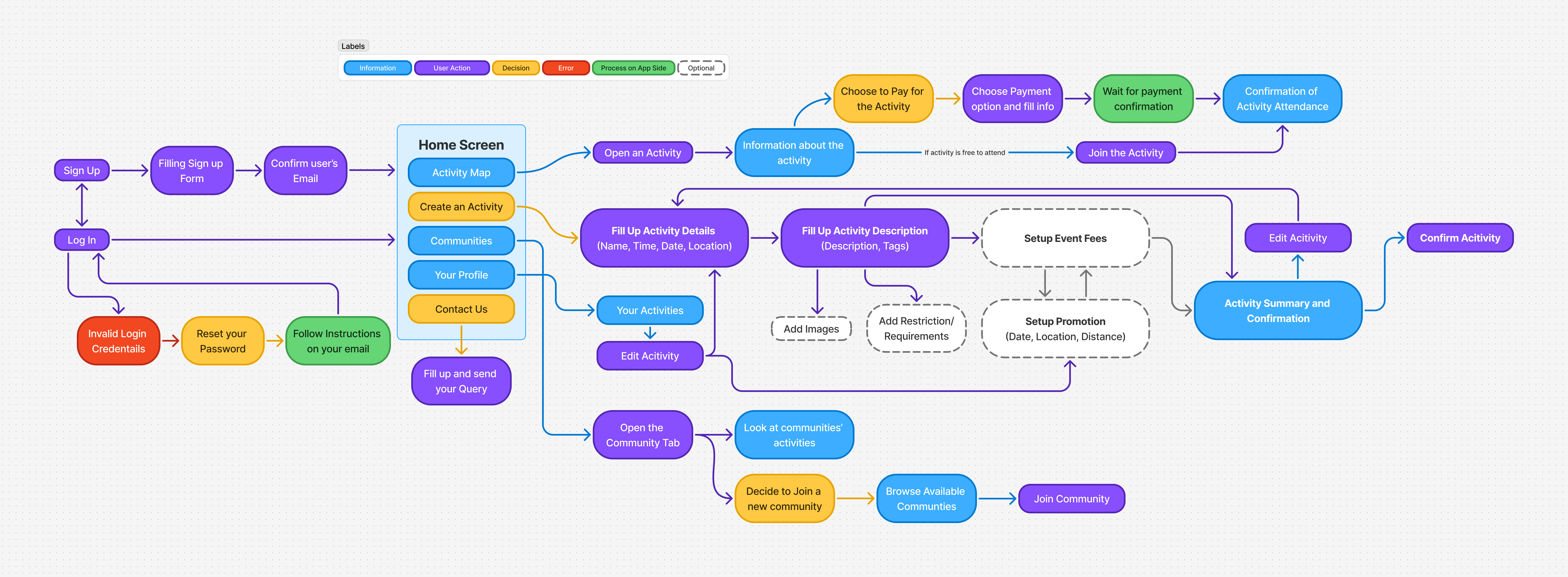
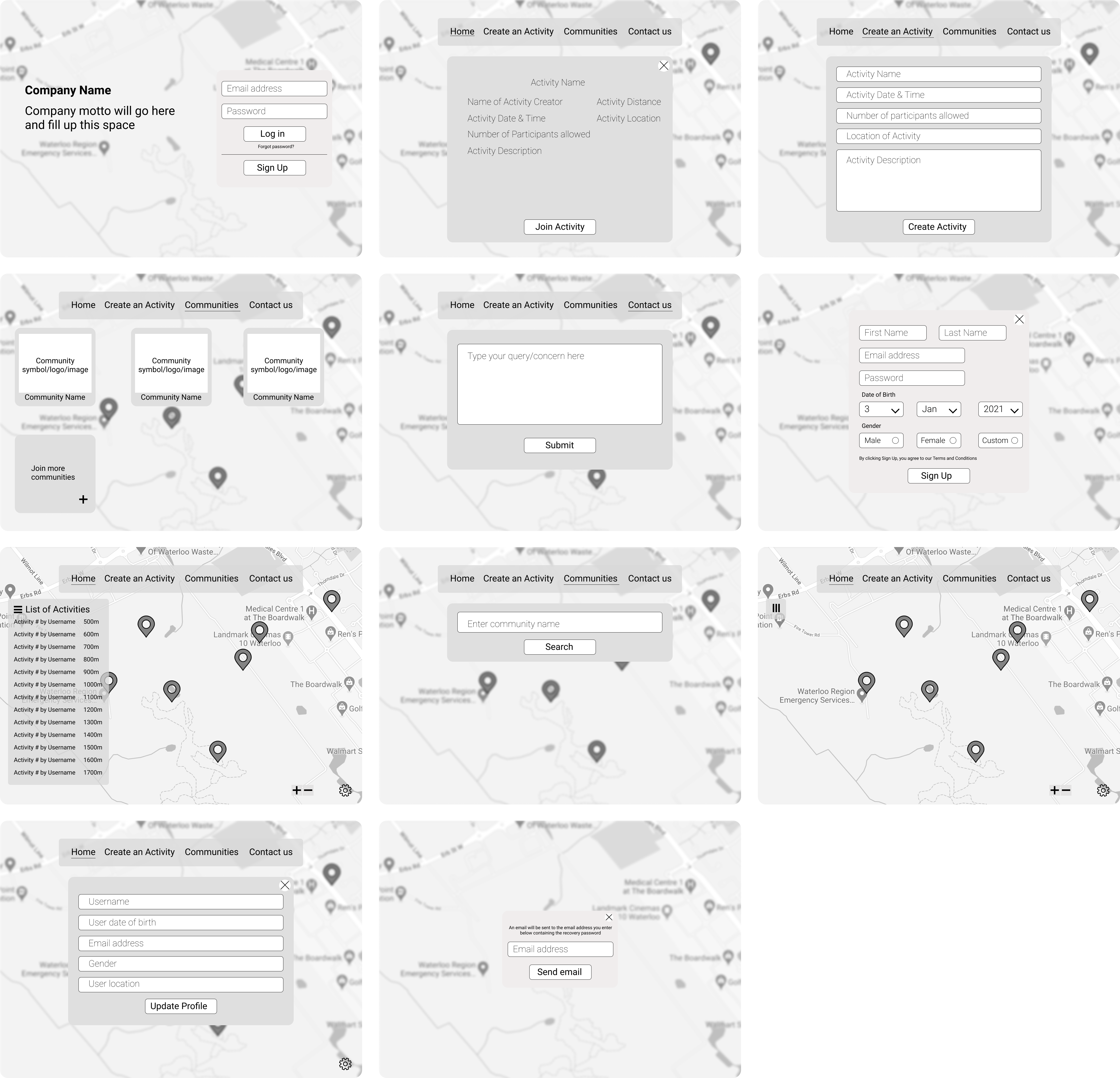
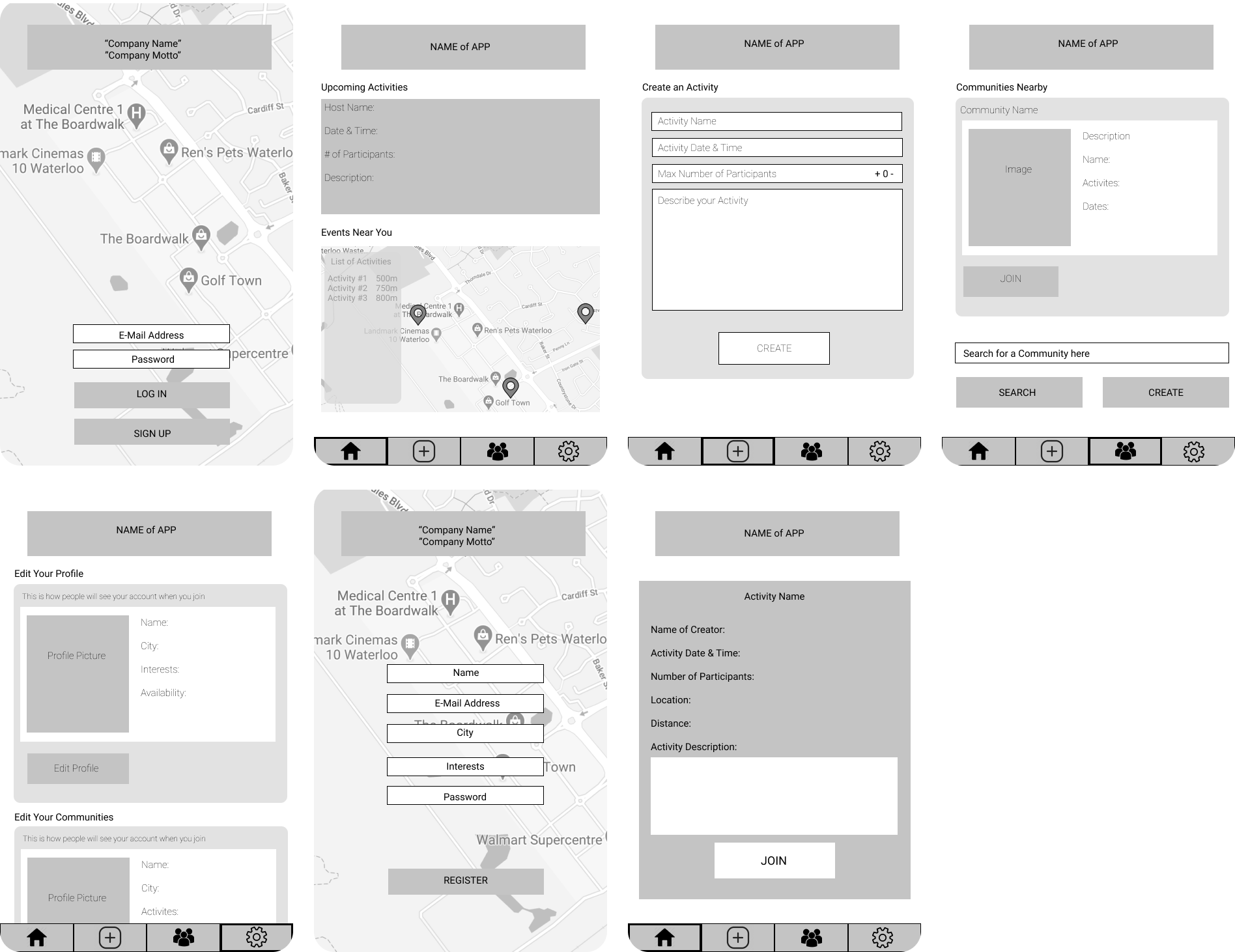
    • Mapped the User Flow and developed Low-Fidelity Prototypes for both web and mobile platforms to visualize the initial design concepts.
    • Conducted Usability Testing and a Survey to gauge the reception of the idea and establish a basic application layout.

User Flow

Low Fidelity Prototype

Desktop Version

Mobile Version

Usability Testing

Testing Method:

  • Conducted an unregulated test on Figma using simple low-fidelity (LoFi) mockups followed by a small survey.
  • Most of our users were between the ages of 18 and 23, which ideally lies in our target demographic, although on the younger side.

User Tasks:

  • Users were tasked with two related activities while navigating through the prototype:
    1. Logging into the app and signing up to attend an activity.
    2. Creating an activity for others to attend.
  • Users had the choice of interacting with either a desktop version or a mobile version, depending on their preferred device.

Findings:

  • Users were mostly able to complete the tasks and navigate the mockup with relative ease.
  • Identified friction in completing tasks due to UX-related reasons, such as a lack of indicators for confirmation when joining an event.
  • Some users indicated that there was too much information being presented, making the whole experience overwhelming and distracting.

Survey Results:

User Feedback:

  • One user mentioned, "I'm not sure if it was just because it was a rough prototype, but the amount of information presented seemed a bit overwhelming to me. It took me aback at first and made me sort of pause before doing anything else."
  • The idea received mixed receptions, with users indicating the need for more emphasis on safety and limitations during COVID-19. Another user commented, "I guess my feedback is to try and focus on what value your app brings specifically. I guess I was expecting more attention to the whole COVID limitation part. To me, it just felt like a way to create events as normal."

Design Improvements:

  • Identified the need to provide information in a more minimalistic and user-friendly way.
  • Recognized the need to optimize button size and design, as some users found the buttons too small.
  • Considered modifying the visual layout of the application to appear more modern and friendly, including changes to spacing between headings on the menu and the overall menu design.

User Suggestions:

  • Users suggested that the app should focus on creating a more minimalistic design, with less information presented at once.
  • They also recommended emphasizing safety measures and limitations during COVID-19 to ensure users feel comfortable using the app.

Iteration 2: Branding & High-Fidelity Development

In our second iteration, our main focus was to define the identity and characteristics of our user persona while establishing a strong brand through visual design. Additionally, we conducted another round of user testing for our mid-fidelity prototype.

  • Iteration Highlights:
    • Establishing User Persona.
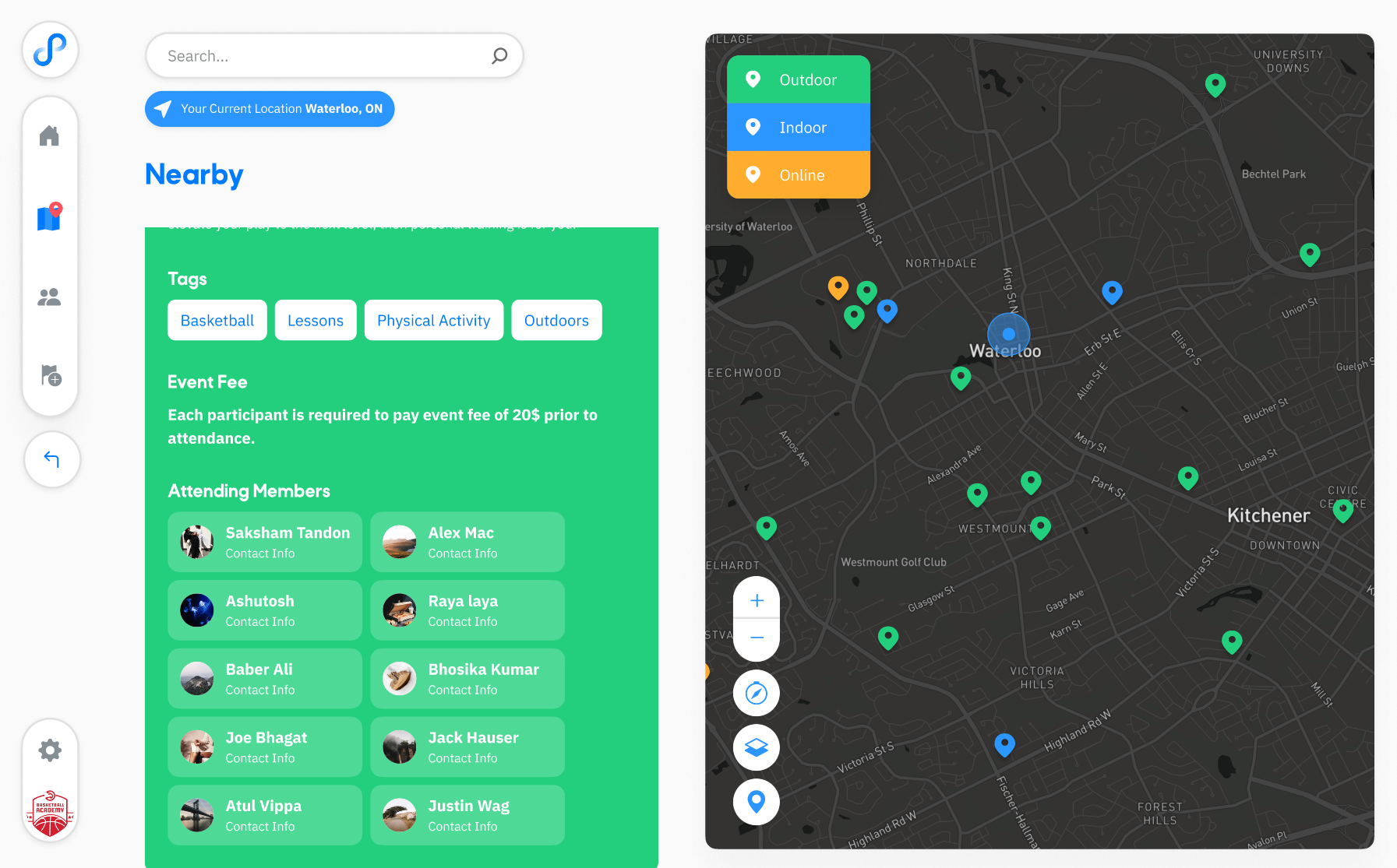
    • Coming up with the branding and Mid-fidelty prototype in a minimalist style with feedback from previous iteration.
    • Improving the User Flow for joining activities.
    • Adding features like an attendee list to comply with COVID-19 gathering restrictions.

User Persona

Demeter• ∆ημήτηρ
“Goddess of grain, agriculture, harvest, growth, and nourishment.”

The person is looking for opportunities to grow. They are willing to take most opportunities that offer a path for personal development. They regularly venture out to new place in search of opportunities like better working conditions, better salary, better living standards etc.

Their motivation generally comes from living in either sub-par conditions and want to grow out of it or have connections to other people who grew out of those kind conditions and want to follow their lead.

They are often independent when it comes to living and are financially stable conditions. They also show occasional interests in passions with main focus on activities that can help them grow.

How has COVID-19 impacted your lifestyle ?

“Covid has a caused a major overhaul to the way we approached finding jobs and other activities. It has certainly caused a decrease in number of opportunities.”

What are your future plans ?

“Covid has a caused a major overhaul to the way we approached finding jobs and other activities. It has certainly caused a decrease in number of opportunities.”

How do you deal with stress ?

Stress is part of life, I work then I also like to do leisure activities like gaming and going on long drives”

The card styling was inspired by the Neumorphic style trending at that time. User Persona inspired by this study here https://www.carolinapizatto.com/reviving-personas

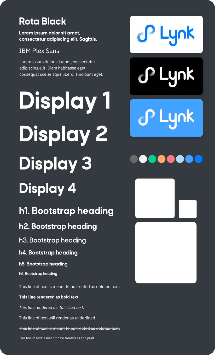
Branding and Visual Design:

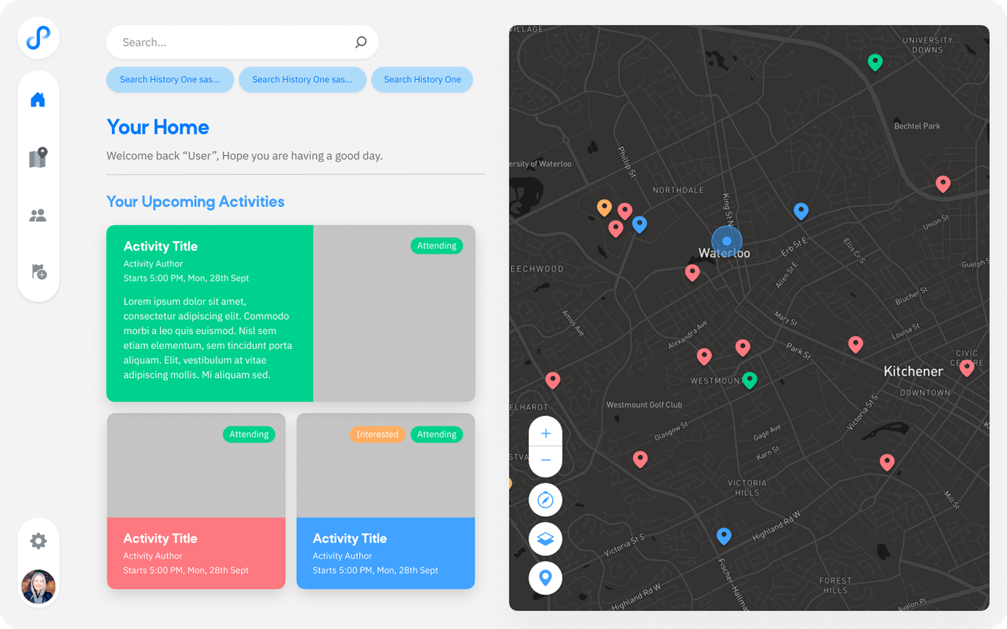
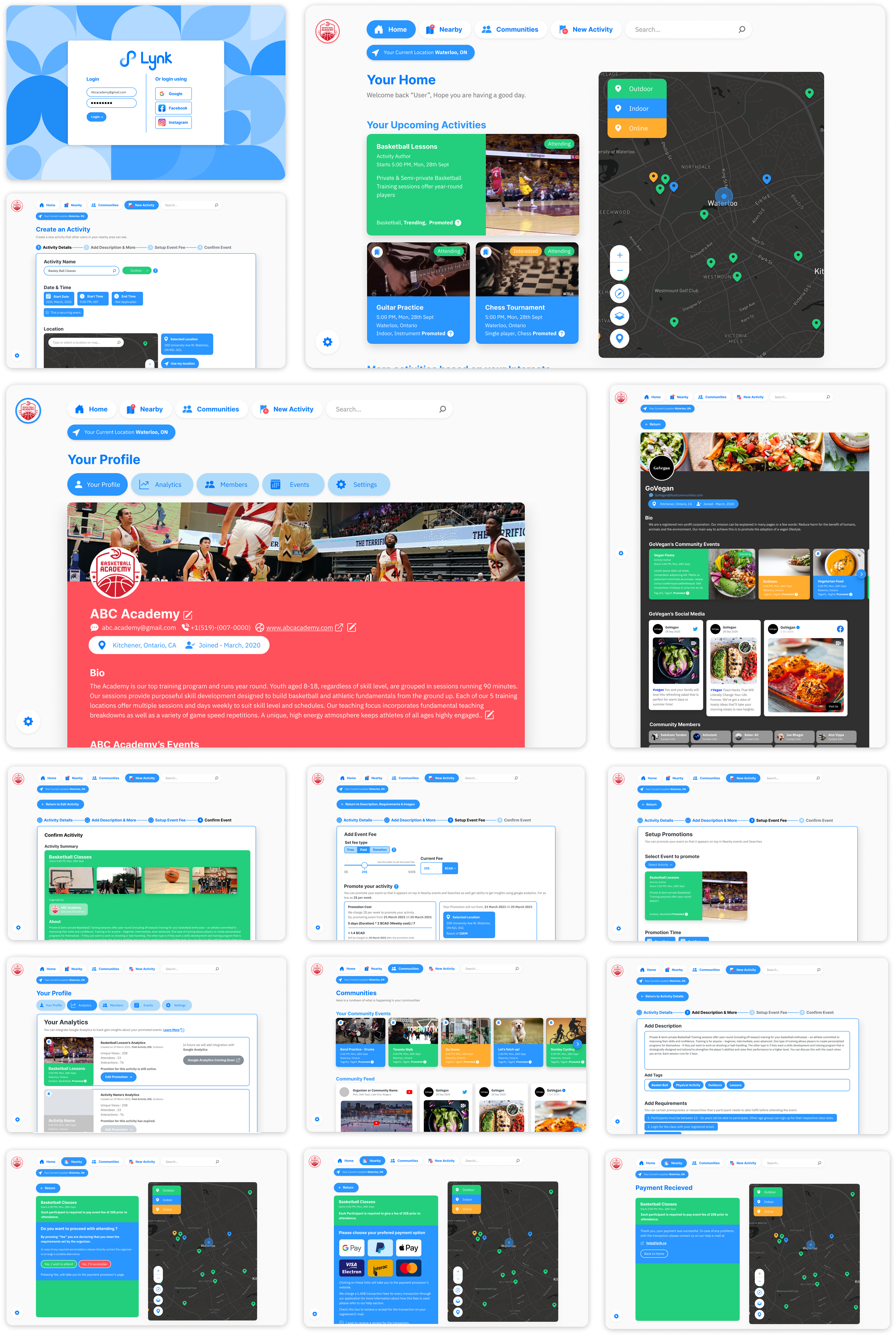
In-progress High Fidelity Mockup:

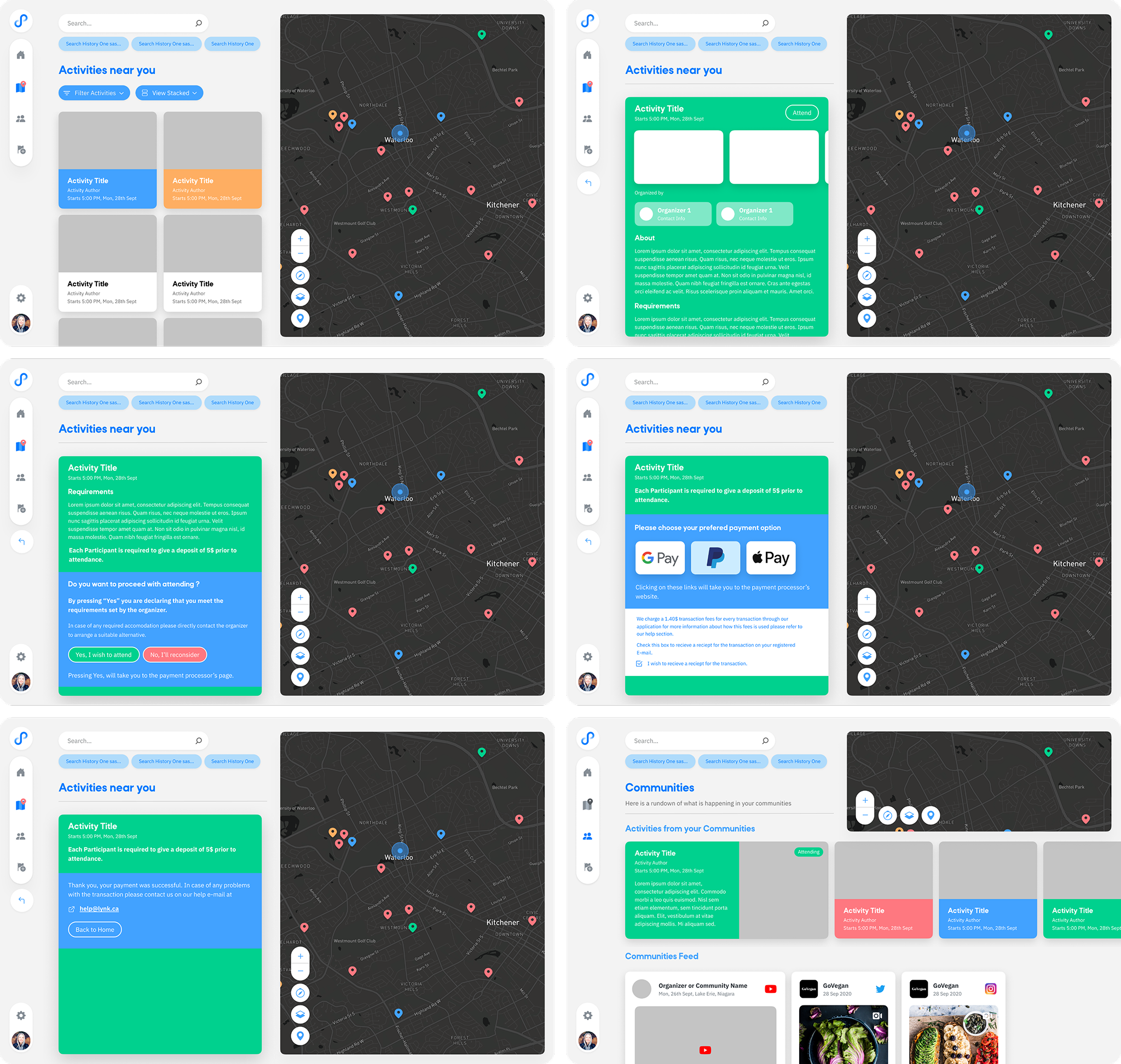
Improved User Flow for Joining Activities

We refined the user flow based on feedback from the first iteration, ensuring that users can easily navigate through the app to find and join activities.

Joining Activities Preview
0:00
/
0:00
Creating Activities Preview
0:00
/
0:00

Adding List Attendees

With feedback from the first iteration, we added a feature to allow users to see who else is attending an activity and helping users gauge the density of crowd before signing up in concern for COVID-19. Users can also appear as anonymous to others if they choose to do so.

Usability Testing - 2

Testing Method

  • We conducted another round of unregulated testing on Figma using our mid-fidelity prototype and asked users to fill out a survey, though the turnout was underwhelming. We focused on evaluating the results for our improved activity sign-up process and deferred the mobile prototype for later due to time constraints.

User Tasks

  • Users were asked to perform the following tasks:
    1. Sign up for the app.
    2. Create an activity for others to join.

Findings

  • Users provided very positive responses on the visual aspects of the app.
  • However, users still had difficulties finding where to create and sign up for an activity.

Survey Results:

Learnings from User Feedback:

  • The amount of information presented was overwhelming for some users, causing hesitation.
  • Users found it hard to differentiate between types of buttons.
  • There was confusion about the relevance of the company name and motto.
  • Clarity in wording is crucial, as some users found certain phrases confusing.

Improvements to be Made:

  • Adopt a more minimalistic and user-friendly information presentation.
  • Optimize buttons and design for better flow and better differentiation for different actions.
  • Replace the company name and motto with a logo to save screen space.

User Suggestions:

  • Allow users to add activities to different interest categories, making it easier to discover and organize events based on personal preferences.
  • Consider adding an optional tour for new users to help them navigate and understand app functions.

Iteration 3: UX Testing & Interaction Refinement

Our focus in iteration three was to improve the usability of key user flows based on feedback, especially the process of creating an activity. We tested a more complete desktop prototype and used structured feedback to guide design revisions.

  • Iteration Highlights:
    • Conducted one-on-one usability testing with participants using the high-fidelity desktop prototype.
    • Used Kano Model survey to assess feature expectations and categorize them by priority.
    • Focused testing on how users navigated and interacted with the "Create Activity" flow.

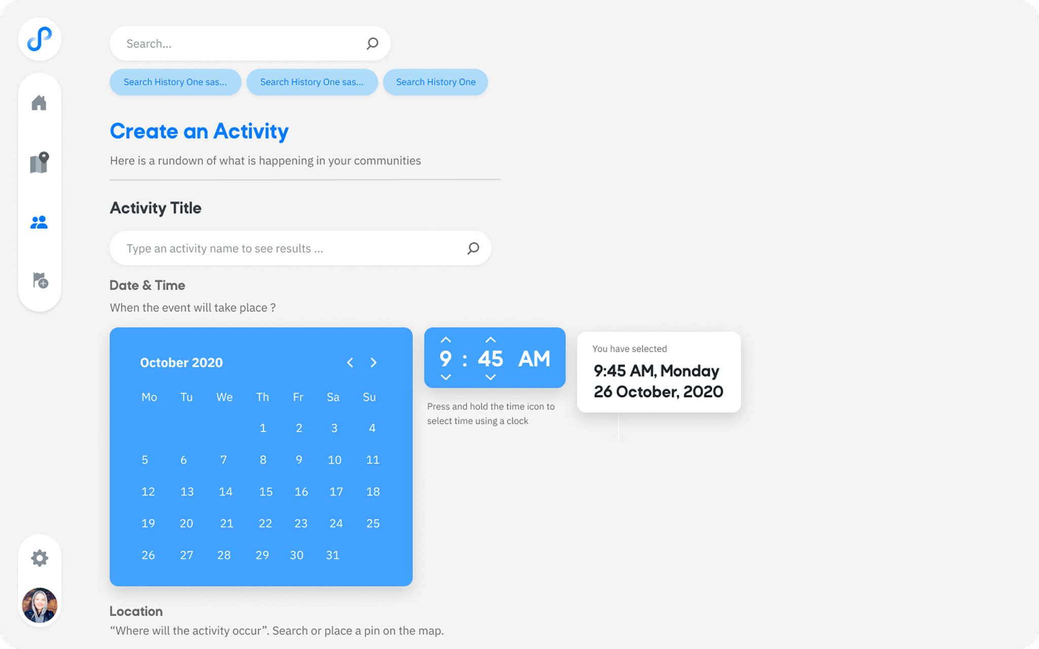
Improved Creating Activity Flow

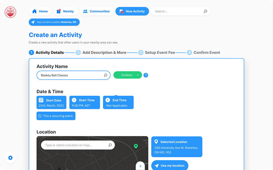
Split the activity creation flow into multiple pages to make the information easier for users to understand and complete.

Improved Creating Activities Preview
0:00
/
0:00

Kano Model Survey

Kano Model Summary

  • Features like the ratings system, feedback submission, and promoted events were considered mandatory by most users.
  • Users also expected features common in similar platforms (e.g., notifications, friend invites).
Functional Questions Tally
FEATURE QUESTIONI like it that wayI expect it to be that wayI am neutralI can live with it that wayI dislike it that way
If you received in-app offers & discounts, how would you feel?32
If you received app notifications, how would you feel?41
If you were able to send & receive friend invite offers, how would you feel?32
If you were able to share your experience with the app through feedback, how would you feel?41
If you had access to a ratings system, how would you feel?41
If the application was cost friendly, how would you feel?41
If there were new product features and updates, how would you feel?41
If you could create events through the app, how would you feel?32
If you could link your social media account(s), how would that make you feel?41
If you could participate in promoted events, how would you feel?221
Dysfunctional Questions Tally
FEATURE QUESTIONI like it that wayI expect it to be that wayI am neutralI can live with it that wayI dislike it that way
If you DID NOT receive in-app offers & discounts, how would you feel?122
If you DID NOT receive app notifications, how would you feel?32
If you were NOT able to send & receive friend invite offers, how would you feel?32
If you were NOT able to share your experience with the app through feedback, how would you feel?14
If you had NO access to a ratings system, how would you feel?23
If the application was NOT cost friendly, how would you feel?23
If there were NO new product features and updates, how would you feel?23
If you could NOT create events through the app, how would you feel?23
If you could NOT link your social media account(s), how would that make you feel?23
If you could NOT participate in promoted events, how would you feel?14
Final Results Tally
FEATUREExciterLinearMandatoryIndifferentQuestionableReverseFINAL EVAL
in-app offers & discounts3 (60%)2 (40%)E
app notifications4 (80%)1 (20%)E
send & receive friend invite offers3 (60%)2 (40%)E
share your experience with the app through feedback1 (20%)3 (60%)1 (20%)M
access to a ratings system5 (100%)M
the application was cost friendly2 (40%)1 (20%)1 (20%)1 (20%)E
new product features and updates3 (60%)1 (20%)1 (20%)E
create events through the app4 (80%)1 (20%)E
link your social media account(s)5 (100%)I
participate in promoted events3 (60%)2 (40%)M

Final Results Summary

  • Exciter Features: In-app offers & discounts, app notifications, send & receive friend invite offers, cost-friendly application, new product features and updates, create events through the app.
  • Mandatory Features: Share your experience through feedback, access to a ratings system, participate in promoted events.
  • Indifferent Feature: Link your social media account(s).

Usability Testing - 3

Testing Method:

  • Conducted moderated user testing using our desktop prototype.
  • Users were observed while completing key flows, followed by a short feedback session.

User Tasks:

  • Create an account.
  • Explore and join an activity.
  • Create a new activity using the full creation flow.

Findings:

  • Users were confused by the number of steps required to create an activity.
  • The lack of visual cues and guidance during form-filling led to hesitation.
  • Several users struggled with horizontal scrolling, which disrupted the flow.
  • Some UI elements lacked context, resulting in questions like "What does this button do?"

Survey Results:

User Feedback:

  • “I wasn’t sure if I completed the activity creation process properly. It needs more guidance.”
  • “There’s a lot going on in the form. Not sure where to start or what’s important.”
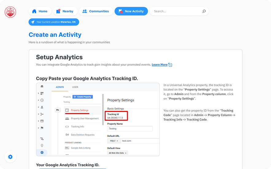
  • Improve the Google Analytics linking page.

Design Improvements:

  • Simplify the activity creation flow by reducing input fields and grouping them logically.
  • Replace horizontal scrolling with vertical sections for better clarity.
  • Add contextual indicators (e.g., tooltips, inline hints) to improve comprehension.
  • Defered the Google Analytics feature to be added after release with more refinement.

User Suggestions:

  • Provide a progress indicator or guided steps during the activity creation process.
  • Remove horizontal scroll areas and use a cleaner, stacked layout.
  • Add brief explanations for form sections to reduce confusion.

Observations from directly observing users

Because of the low turnout of participants from the survey, we decided to conduct a moderated usability test with another 2 participants on video-call. We observed them as they navigated through the prototype and took notes on their interactions. This provided us with valuable insights into their thought processes and decision-making.

Navigation and Accessibility

  • Confusion on how to navigate to certain sections.
  • Missing logo navigation.
  • Need for clearer instructions on selecting thumbnails for events.

Interface and Usability

  • Interface needs better descriptions.
  • Confusion about creating mechanics and labels.
  • Feedback indicates confusion with unclear directions.
  • Need for search history or contextual help.
  • Navigation buttons need better differentiation and input capability.

Design and Content

  • Flavor is inconsistent and not exciting.
  • Prototype sends mixed signals.
  • App organization is confusing; needs better explanation on startup.
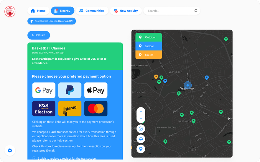
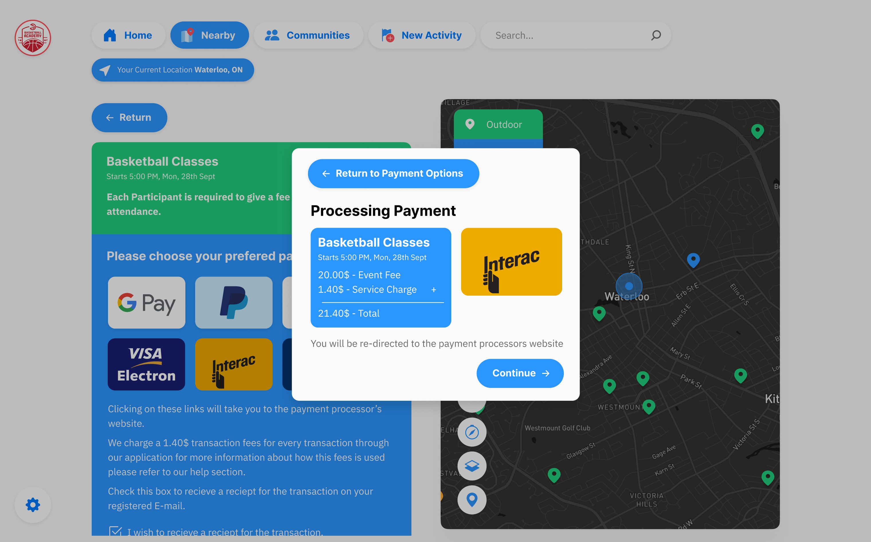
  • Payment confirmation should use a pop-up.
Final Changes before MVP

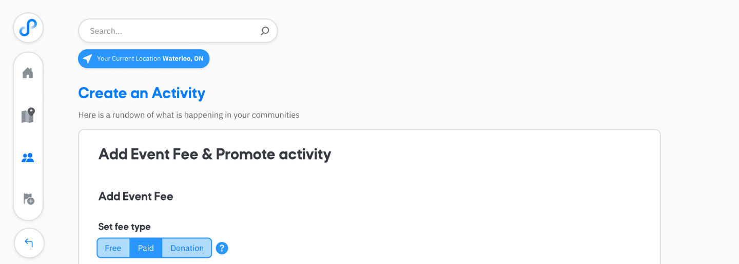
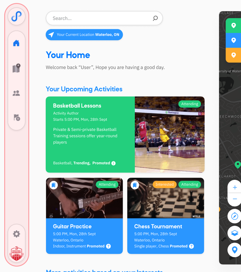
Updating the Navbar from Vertical to Horizontal

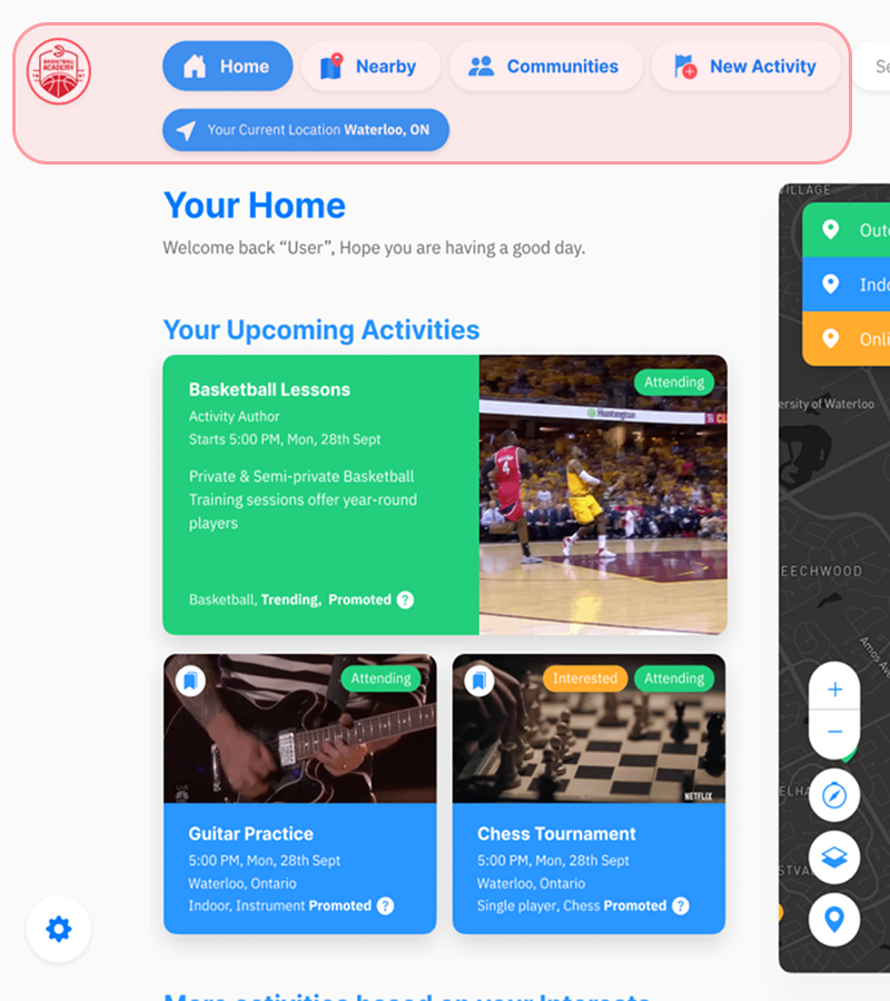
Noting from the final feedback, to improve navigation, we switched the navbar to a horizontal layout with labels visible to give users a clearer understanding of the different sections of the app.

Before
After

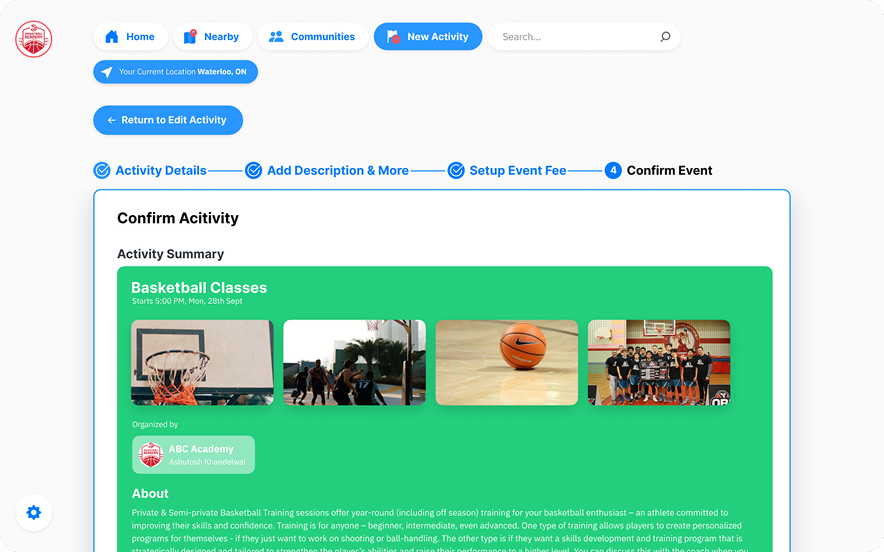
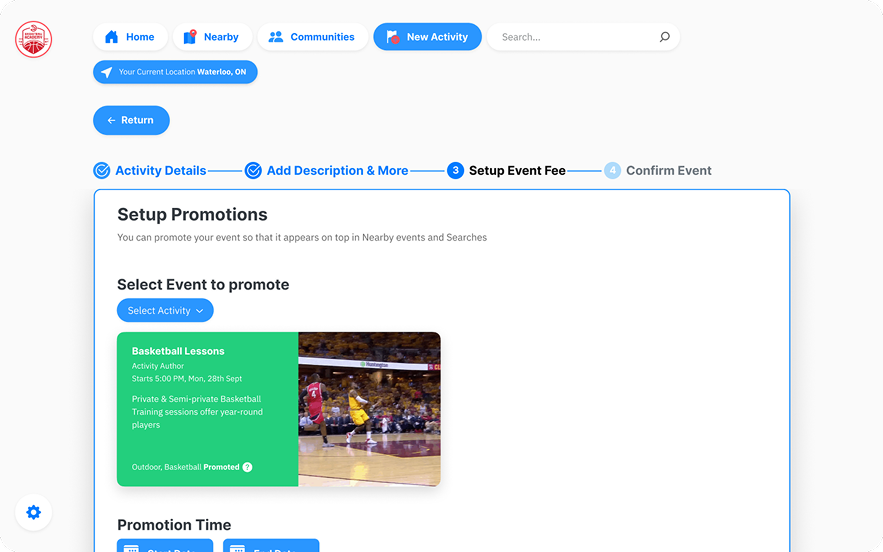
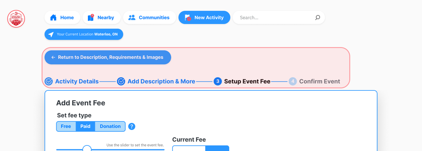
Adding breadcrumbs to the activity creation process

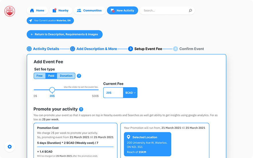
After receiveing feedback from users, we added breadcrumbs to the activity creation process to help users understand their current step within the activity creation step and added a back button with label to navigate back to previous steps easily.

Before
After

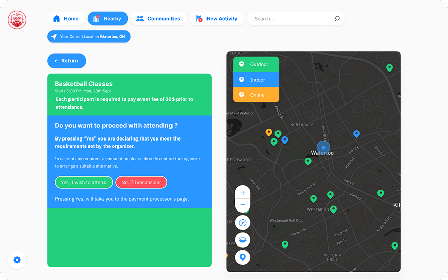
Payment Processor Pop-Up

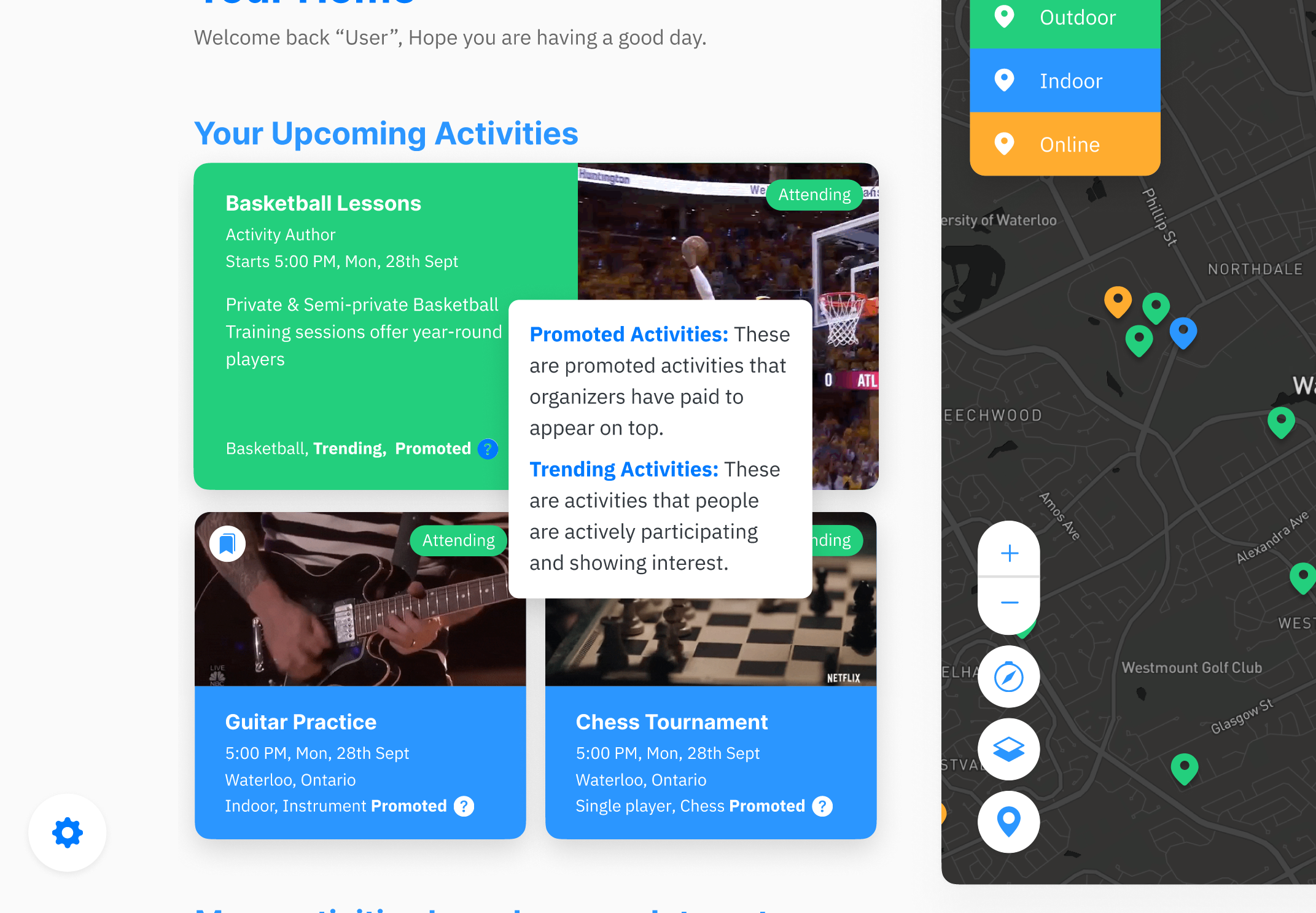
Adding tooltip information for explaining tags

🏆 Final Prototype

Final Presentation

View the full presentation of the project on Youtube

Lynk Full Presentation
0:00
/
0:00
I wasn't able to implement a slider because of an existing bug with the VidStack Videoplayer and Radix-UI, please use gestures to jump in time, double clicking with mouse or touch on the rightside on the videoplayer area jumps forward 10 seconds.
Thanks for visiting! 😊